It will be clearer than ever which universities and colleges are doing well at promoting equal opportunities and where gaps remain, thanks to the latest updates to the Office for Students’ (OfS) access and participation data resources.
The OfS access and participation data dashboard is an interactive way to compare different student groups (for example, disabled students or students by their ethnic background) with their peers to reveal gaps at specific universities and colleges.
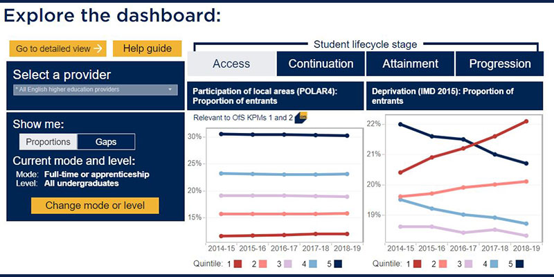
The data covers all universities and colleges registered with the OfS and compares different student characteristics at individual higher education providers and across the whole sector. It includes measures of performance for each stage of a student’s journey through higher education:
- Access measures look at the characteristics of students going into higher education. For example, in 2018-19, only 12 per cent of students were from the most underrepresented backgrounds.
- Continuation measures look at whether students continue their studies or not. For example, of those who started in 2017-18, 92.1 per cent of young students (under 21) continued after their first year, compared to 84 per cent of mature students (21 and over).
- Attainment measures look at how many graduates achieve a first or upper second class degree. For example, in 2018-19, the gap between the proportion of white and black students achieving a first or upper second class degree was 22.1 percentage points.
- Progression measures look at whether graduates are in highly skilled employment or further study six months after finishing their course. For example, in 2016-17, 73.3 per cent of graduates with no known disability were in highly skilled employment or higher level study, compared to only 61.8 per cent of those with a social or communication impairment.
The dashboard was first published in March 2019. Today’s update brings in the most recent student data – for the 2018-19 academic year – as well as making a number of usability improvements:
- A new overview section draws out key information for multiple student characteristics in one view, allowing users to quickly understand a university or college’s general performance.
- A revised detailed view allows users to explore rates, gaps and ratios by different student characteristics – one at a time – to interrogate a university or college’s performance in more detail.
- Selections in drop-down menus have been made ‘sticky’ – in other words, drop-down menus remember a user’s selections as they navigate through different views of the dashboard rather than resetting with each move, as in the previous version.
- A new view allows users to see how each university or college’s students are distributed across different modes (full or part-time) and levels (first degree or other undergraduate qualifications such as foundation degrees and HNCs) of study before choosing which of these modes and levels of study may be the most appropriate to analyse.
- Where data is not available (which may particularly affect smaller higher education providers), the reasons for this are made clearer within the dashboard than has previously been the case.
- New experimental data has been published alongside the dashboard which provides a sector-level overview of students’ entry qualifications and what subjects they study.